Description
CAPITALS FIRST Book 1 Explicit Instruction Uppercase
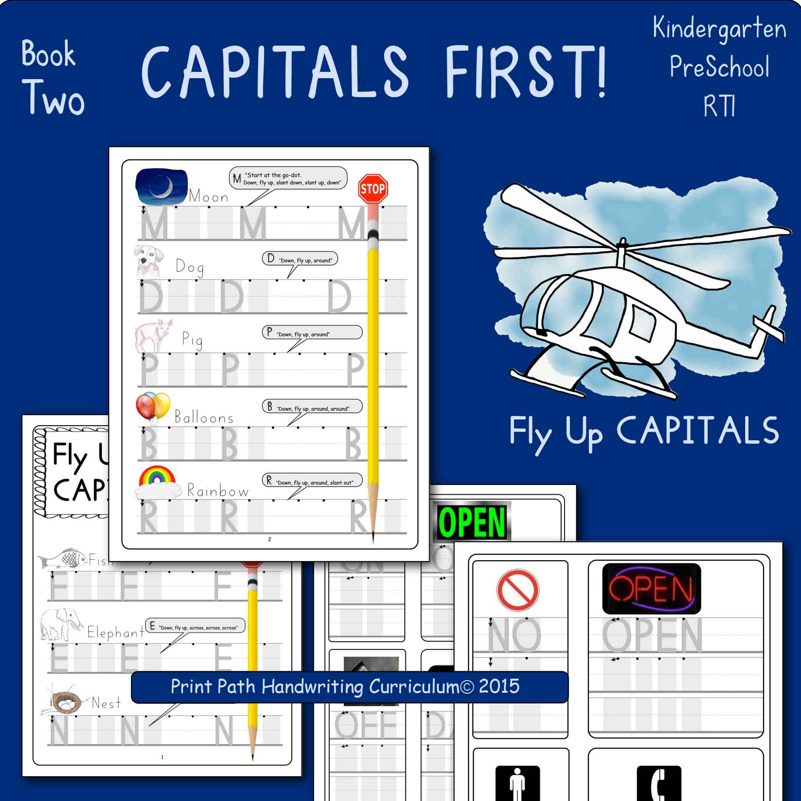
Created by school-based Occupational Therapist, Thia Triggs, the CAPITALS FIRST Book 1 Explicit Instruction Uppercase digital download includes instructions for capital letters made with lines and curves which is the perfect way to start for children to learn letter formations at the top. Print Path letter font is compatible with Handwriting Without Tears materials but allows your children to learn formations on the three-lined paper they are most likely to encounter. Quality handwriting instruction involves more than providing letter worksheets. If you have been giving dashed-line alphabetical-order handwriting worksheets to your students, consider upgrading your handwriting instruction to include research-based best practices. A succinct scope is shared in the Teachers Guide, which is included with the CAPITALS FIRST practice book. Letters are specifically sequenced to help children use skills they already have to learn new letters.
This 30-page PDF digital download will be available electronically immediately following payment and includes:
• Teachers Guide with research-based practices outlined.
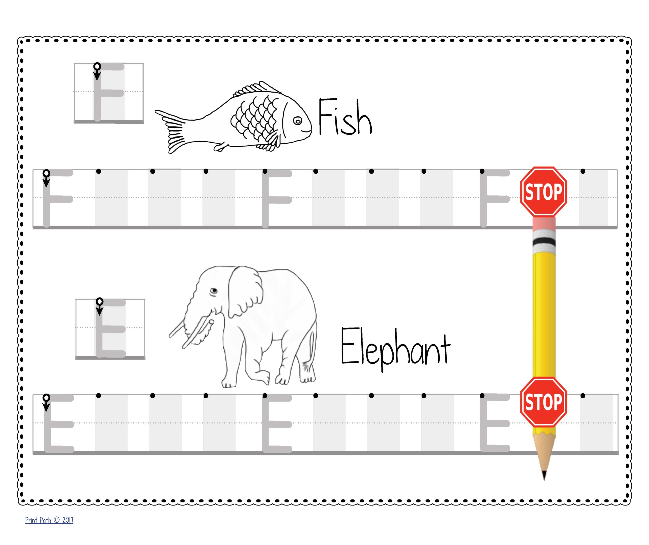
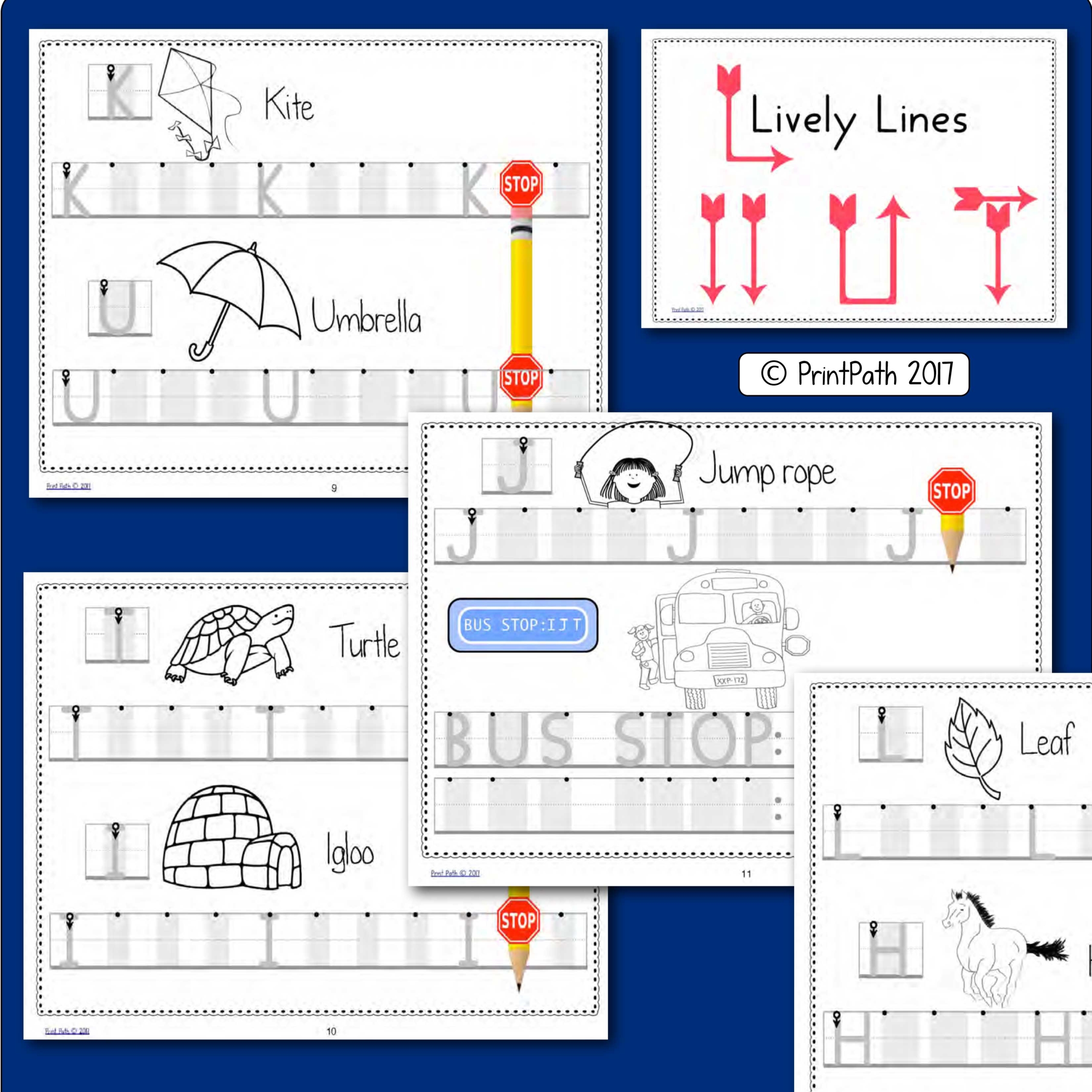
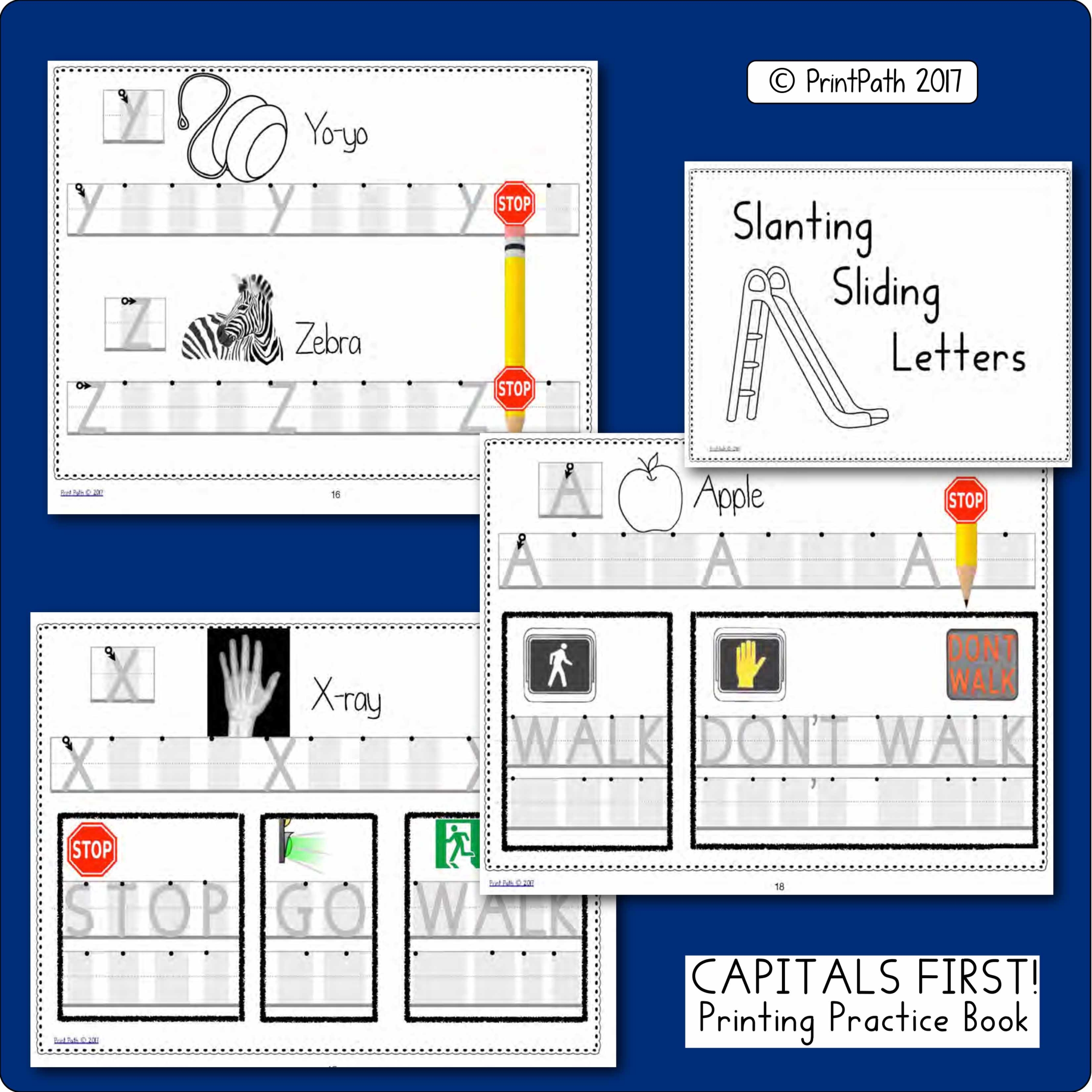
• Practice book with CAPITAL letters grouped and sequenced in a developmental order.
• Structured Sheets provide phonics and reading connections.
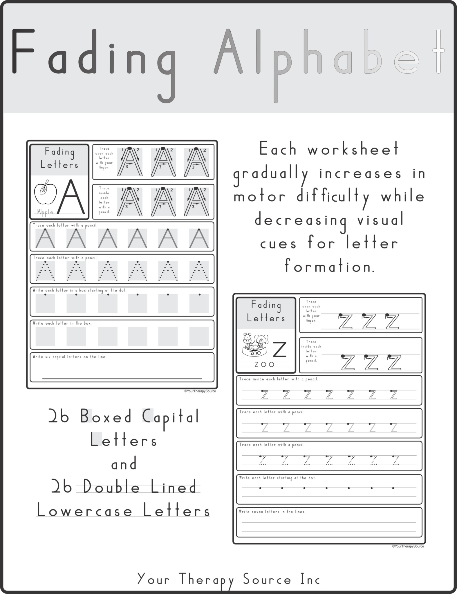
• Gray boxes and go dots serve to help children learn correct motor memory.
• Path of movement language used to teach and help your children recall letter formations. Formation directions use simple directional words [ e.g., down, up, across] that are especially helpful for English Language Learners, and children with disabilities.
Research has shown that children are not ready to form lowercase letters until they can form a square and an X. [Benbow, Hanft, & Marsh, 1992; Beery & Beery, 2010; Daly, Kelley, & Krauss 2003; Marr, Windsor, & Cermak, 2001] We do not want to have children write in lowercase before they are ready as letters that are consistently practiced incorrectly are embedded into motor memory and will lead to future legibility problems.
PrintPath uses its own font that more closely resembles Handwriting Without Tears than Zaner-Bloser or D’Nealian. Letters have a vertical alignment, they do not push off the writing line, and it is visually evident that lowercase letters are mostly made with single strokes. Print Path has its own distinct curriculum with scope, sequence, visual cues, verbal path of movement language, and multisensory methods.
CAPITALS FIRST!: Book Two is designed to be used following basic Print Path instruction with the use of CAPITALS FIRST!: Book One.
Get discount pricing when you order the Handwriting MegaBundle (which includes CAPITALS FIRST Book 1 and Book 2 packet) created by Thia Triggs, OTR.